Building a scalable design system for a $2.5M seed-funded AI SaaS
Atomic design system foundations (tokens → patterns)

Links
Revscale : Atomic Design System (6 months, 1500+ components)
Revscale was scaling fast, but the UI wasn’t. We were mixing multiple UI kits, and engineering couldn’t match design consistently that leading to UI drift, repeated decisions, and slower shipping. I led the effort to audit the platform, define the component + pattern inventory, build a design system in Figma, and align engineering implementation via Storybook
The moment we realized we had a real problem
Revscale had just raised $2.5M in seed funding, and the product roadmap suddenly expanded: more features, more screens, more people touching the UI. On paper, that’s exciting
In reality, something else started happening:
Design would ship a clean, consistent screen in Figma…
…and dev would implement something that looked close, but not quite right

At first, it felt like “small inconsistencies.”
Then it got worse:
a button looked different across pages
spacing and typography varied between modules
table layouts behaved differently in similar contexts
“same component” had 3–4 visual versions depending on who built it
It wasn’t anyone’s fault
We were using different UI kits across the product, and engineering was building components based on whichever reference was closest. Over time, the product started to feel less like a platform and more like a patchwork
That screenshot became the turning point:
If Revscale was going to scale as a product, the UI needed a system not just screens
Why a design system became non-negotiable
A seed-funded company has only two real levers:

UI drift kills both
Every mismatch created:
extra review cycles
redesign-in-dev conversations
rework during QA
inconsistent UX that reduced trust in the product
We weren’t just losing time, we were accumulating design debt
So we aligned on a simple goal:
Goal
Create a single source of truth that keeps design and engineering in sync and helps the team ship faster without UI drift
My Role
I owned the design system initiative end-to-end:
auditing the platform
defining tokens + foundations
building the component and pattern library in Figma
collaborating with engineers to implement components in Storybook
documenting usage so the system stays scalable
What I built
Foundations (Primitives → semantic usage)
Color primitives + Color modes (semantic assignment for text/buttons/backgrounds)
These are the foundational colors in the palette. Think of them as the pure color values that serve as the core, supporting other color groups

Color Mode
Colors assigned for specific use cases, like buttons, text, or backgrounds. Each mode is tailored for a particular function to keep design consistent.
Typography scale

Spacing system
Effects (shadows, blur, elevation rules)
Corner radius rules
Breakpoints
Atomic library (Atoms → Molecules → Patterns)
Atoms include: buttons, toggles, checkbox/radio, avatar, progress indicators, chips, badges
Badge
Buttons
Toggle/Switch
Checkbox
Radio Button
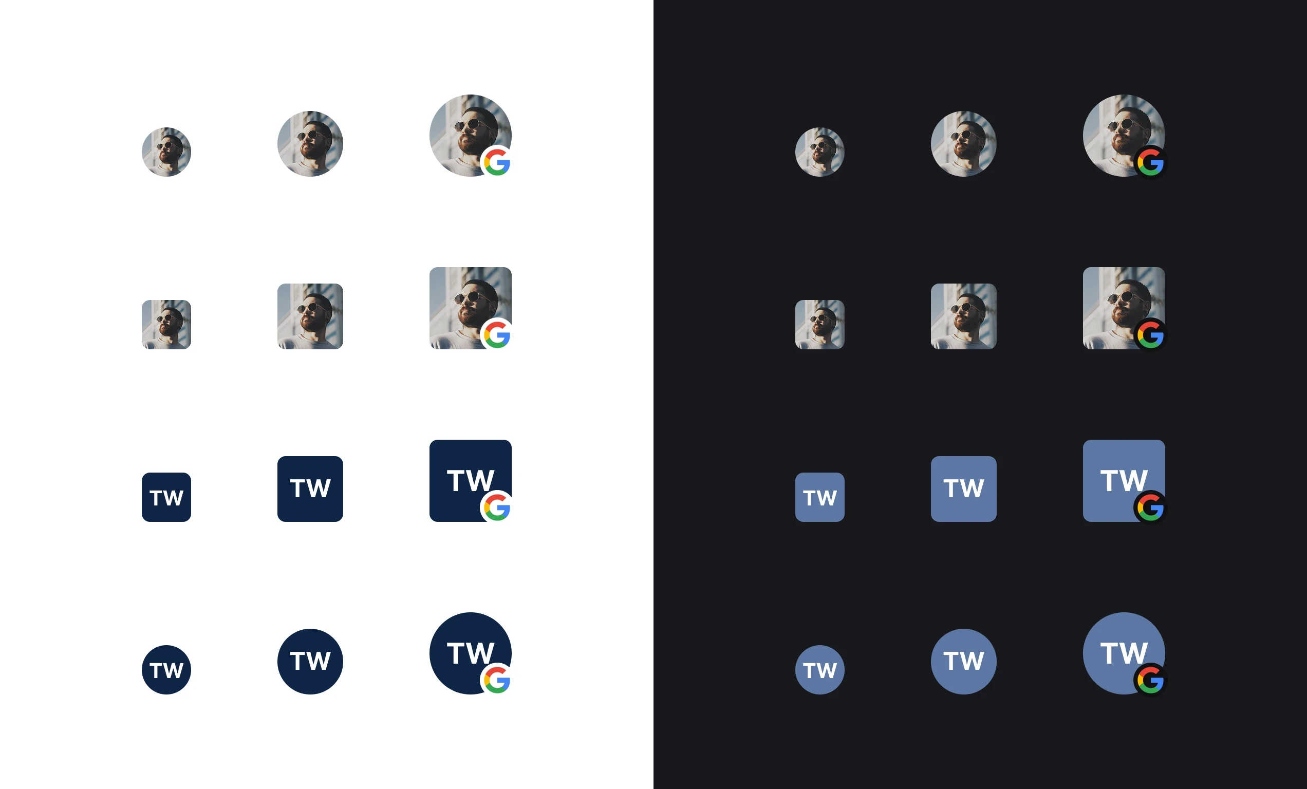
Avatar
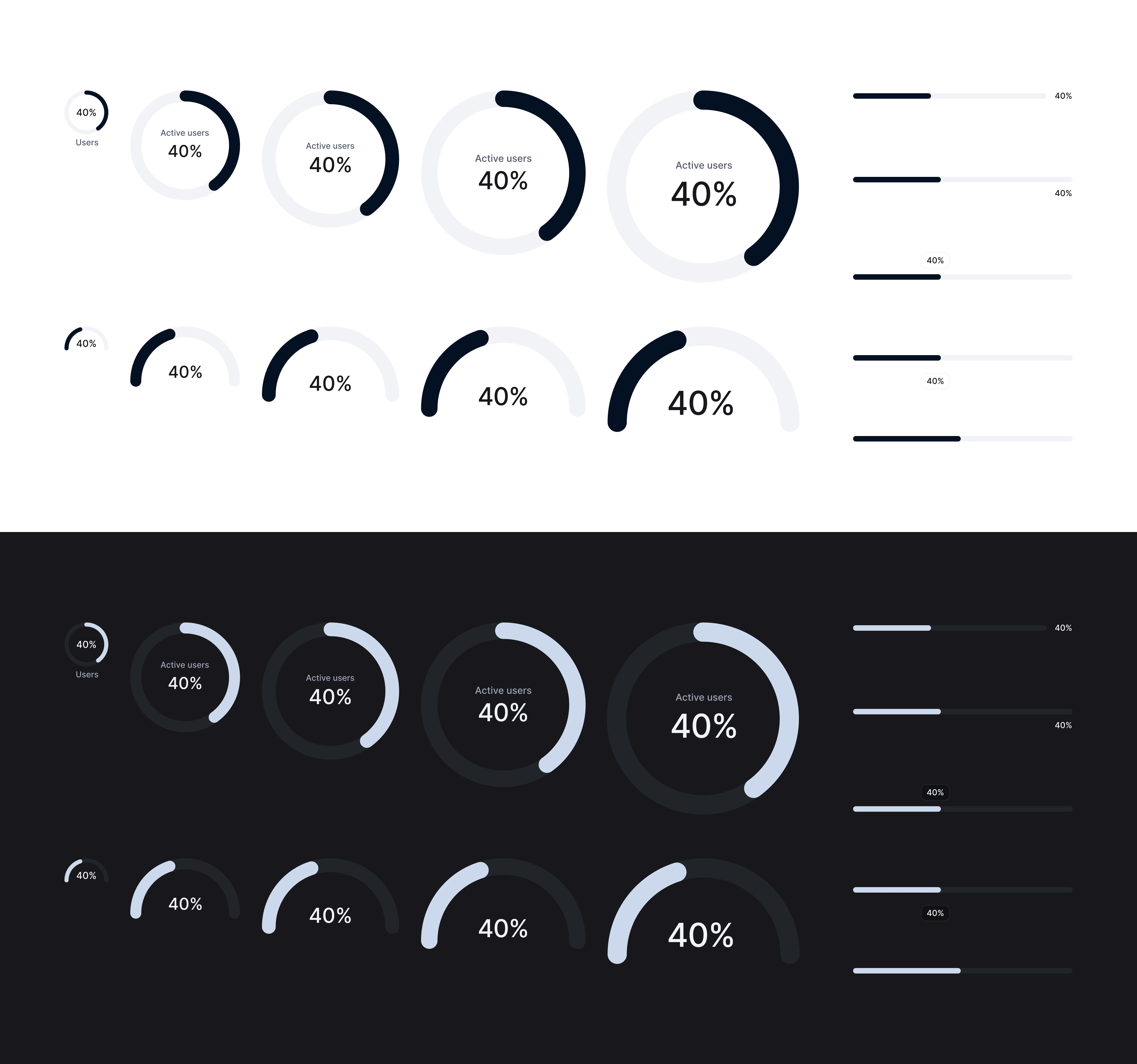
Progress Indicator
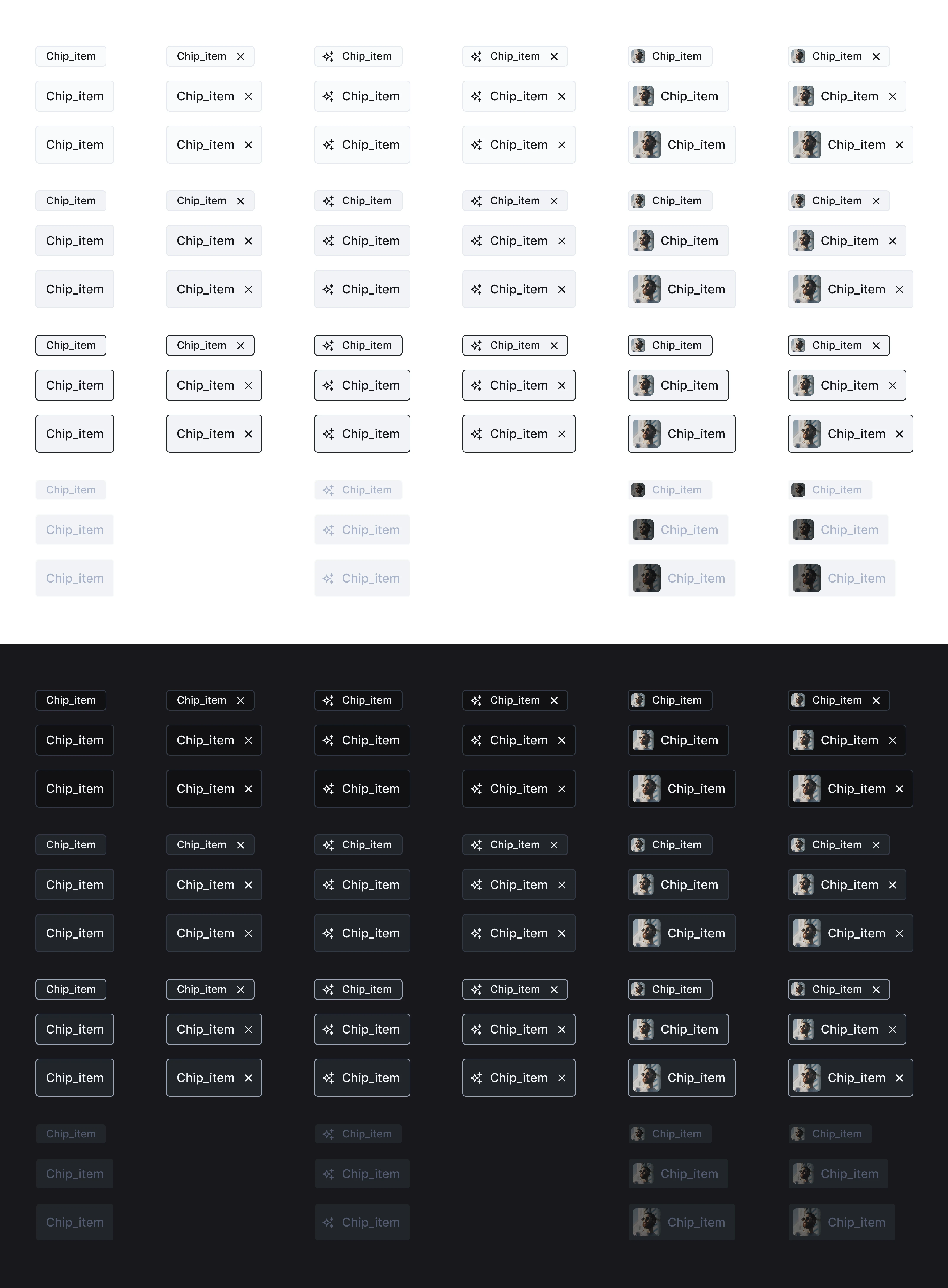
Chips
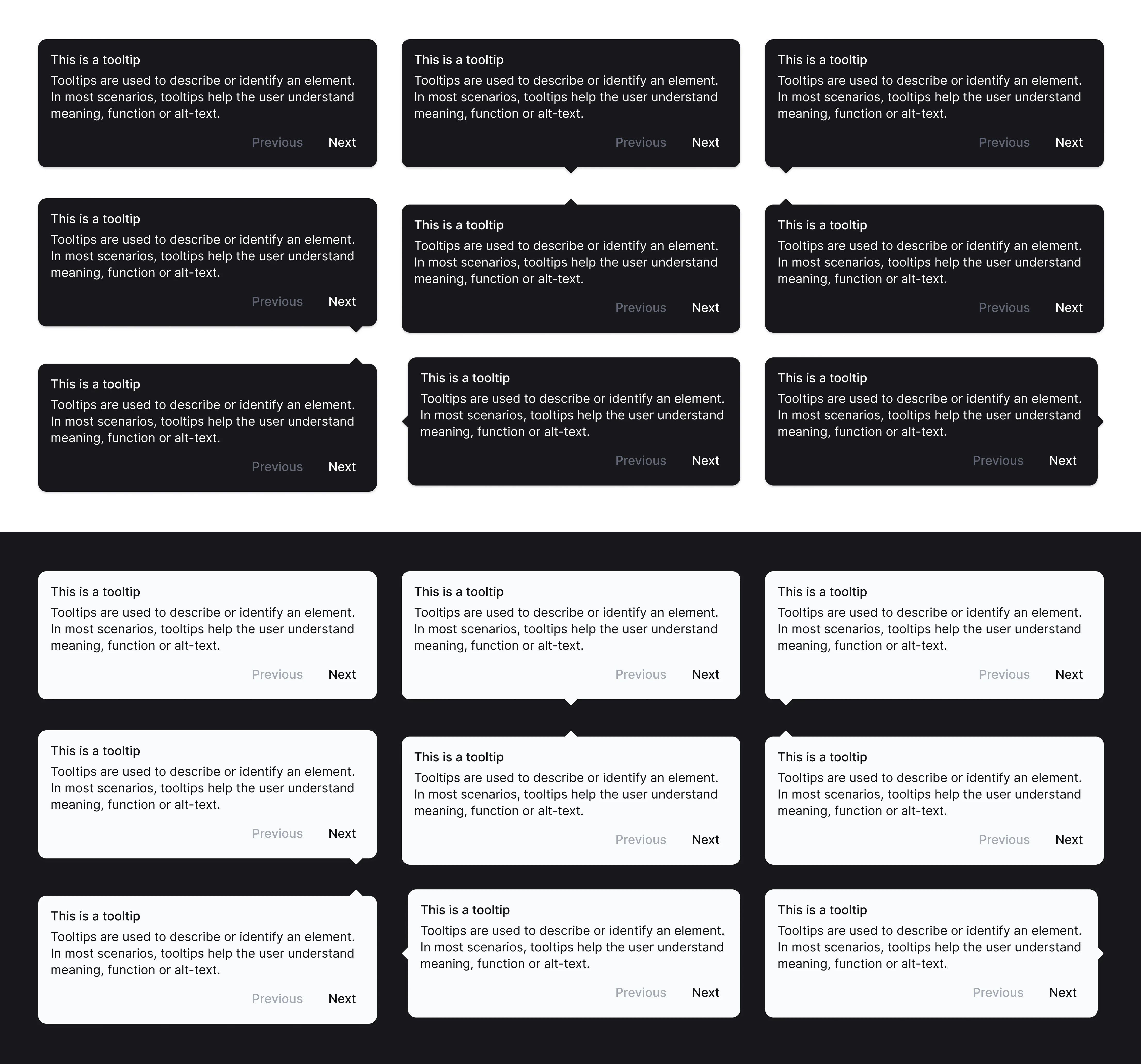
Tool Tips
Slider
Molecules/patterns include: tooltips, slider, toaster, tabs, breadcrumbs, empty states, pagination, dropdowns, dialogs, date picker, inputs, search, filters, text areas, tables, skeleton loaders, upload, OTP, alerts, navigation
Toaster
Tabs
Breadcrumbs
Empty States
Pagination
Dropdown
Dialog
Date Picker
Input
Search Bar
Filter
Text Area
Tables
Skelton Loader
Upload FIle
OTP
Notification Floating
Alert

Top Navigation
Slider Navigation
System principles
Semantic tokens over raw values (design-to-dev consistency)
Patterns > components (teams ship flows, not Lego pieces)
Light + dark parity (no “second-class” theme)
State completeness (loading/empty/error/disabled done once, reused everywhere)
What I’d do next
Track adoption (component usage, drift score)
Add governance + migration playbook for legacy screens
Publish “golden path” templates for the most-used workflows (tables, forms, creation flows)
Recruiter Testimonial